If you read this blog on dltn.io, you might have noticed a new coat of paint recently. I didn’t do anything too drastic, but I love the new look. It’s simple, elegant, and timeless.
Here’s what’s new.
Design
I changed the background color from a blue-white to a pure white. There are still tones of blue, but not as much. The current color is #FAFAFA and the previous one was #FAFBFF.
The color of the links are now a deeper shade of blue. I like this look because it’s more typical of what the color of a link is “thought” to be.
Homepage layout
The biggest structural change was to my homepage. I removed the loop of tags because the list of tags and the list of posts brought my eye to too many different places at once. I liked that someone visiting the site for the first time instantly got an idea of what I wrote about, but it was just too much.
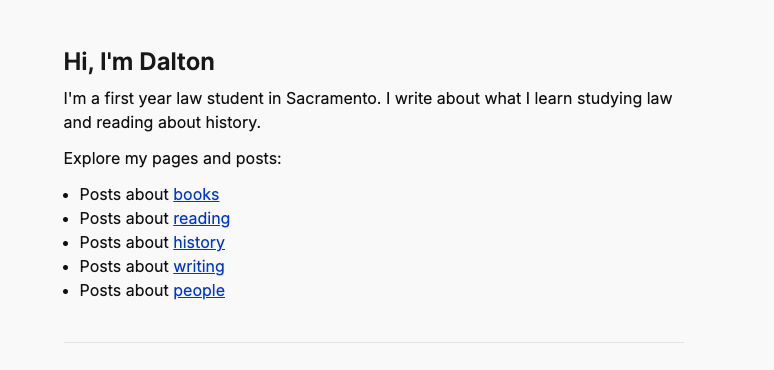
In its stead, I made this simple list of my favorite tags to write about, which just so happens to also be the tags that contain the majority of the posts. This gives me the benefit of having someone see what I write about when they first land on the page without being overwhelmed.
In a big change, I removed my subscribe callout. There are two reasons for this:
- It wasn’t converting. I don’t know if my language wasn’t right or if people just don’t read stuff on the homepage, but I’d only get three or four signups per month.
- I’m not sending my newsletter as frequently. When I first started blogging, everyone and their mother had a newsletter, but I could never quite find my rhythm with it. I’d rather just blog about what I want, when I want, and not worry about “bothering” people with my posts. I might add the signup form in the footer, or add a separate subscribe page eventually, but for now it’s gone. (You can still subscribe via RSS.)
I’ve been trying for months now to create a design I liked more than what I had before, but every time I came up with something new, I always just liked what I had before, better. I was always basing my re-designs on what I saw other people were doing on their sites, and I think I never allowed myself to just sit down and code to see what I came up with until I worked on this design.
One day, I sat down after a long day of school with nothing but time and the clear intention to just get something fresh and new pushed to main so I could get back to studying (because I have been slightly distracted by re-designing this lately). Since I was free of any time constraints, and wasn’t worried about staying up too late, I just got into the zone and made something. I think that speaks to trusting yourself when it comes to creative projects. Mood boards and inspiration are good, but don’t let those things replace your creative brain!
Why the “boring-ness?”
The reason I like the white background, black text, and blue links is because of my ideal career. I know I can do more “fun” things with my site, and it probably doesn’t really matter, but if a potential firm or client lands on my blog, I want to project an image of sturdiness and seriousness. Admittedly that sounds cheesy, but I believe it, and it’s what’s keeping me from having a dark blue background and light blue text. I love that look, but I just can’t pull it off right now.
That’s also why I’ve been debating using a serif typeface. Serifs are serious and educated and academic. I love all of those things, but when I read a short blog post on my phone in a typeface that looks like it belongs in a newspaper, something just feels “off.” I’ve yet to find a good looking but not too serious serif typeface. So, for the time being, I’ll continue using my trusty Inter.
New feature: Links!
Inspired by Jim Nielsen and Robb Knight, I’ve decided to build out a /links page. I’m not really using social media anymore, but I still have a desire to share what I read and learn with others. Sometimes I blog about things, but other times I just have a quick thought I want to share along with a great quote. That isn’t enough content for me to make a full blog post, but now I can make a new link post.
How it works
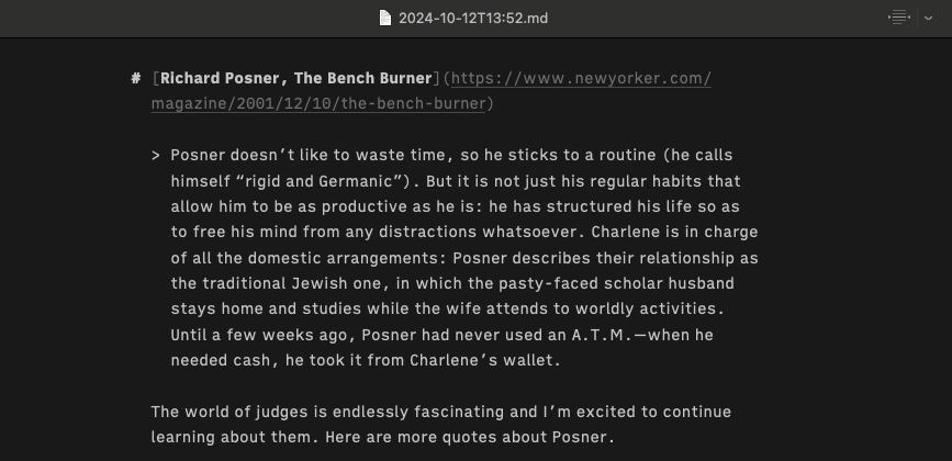
Technically: I have two folders in my repo: posts and links. When I want to post a new link, I make a new page in iA Writer and type the title of the article as an H1. Then I highlight the H1 and paste the link to the article. In the body I add quotes and thoughts. Finally, I name the file the current date and time: 2024-10-12T14:54. My backend strips the first H1 and saves it to a title property, the link gets stripped and saved to a link property and the file name minus the extension becomes the id. (This is all based on Jim’s process.)
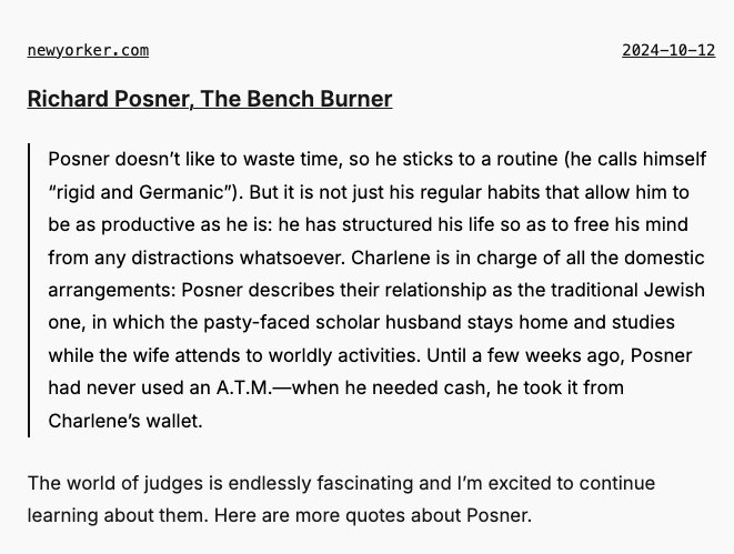
On my /links page, I loop over every file in the links directory and pass the properties to a LinksDisplay component. I use psl to strip the domain name from the link variable, which is how it’s displayed on the page.
So, this file in iA writer...
...becomes this on my site...
Procedurally: I read every article on Readwise’s Reader app. (It’s great, check it out.) Highlights and notes I take from articles automatically get saved to Obsidian. When I have some time to sort through my notes, I open Obsidian and find any quotes that still resonate with me. When I find one, I follow the process above.
There is probably a way to automate this by pointing my /links directory to my Readwise folder, which actually could be a very fun, tough project to work on. But part of the learning process is re-examining what I saved and realizing much of it is not worth internalizing. Separating the wheat from the chaff is a slow but valuable process when it comes to retaining information.
As Jim points out, the benefit of having everything in one page is that, if you need to find a quote, you can simply do a CMND + F search of all your notes, which would be super valuable when you’re on the go.
New layout: Notes!
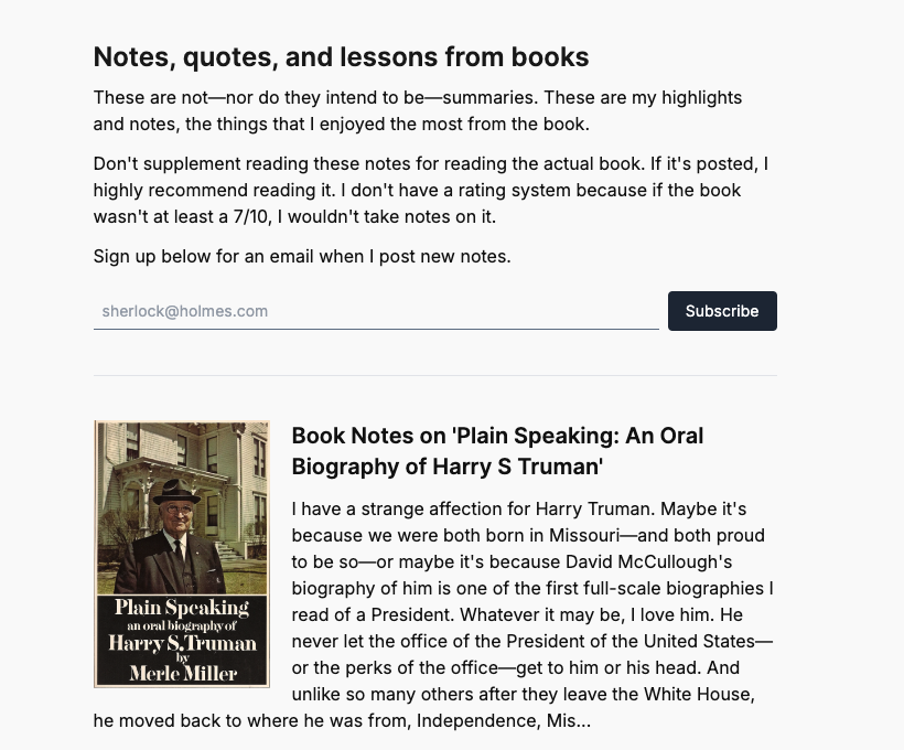
I’ve slightly altered my /notes page. Before, it was just a three-column grid of book covers. It worked; it was simple and clear. But I wanted to add more information about the books before someone clicked on one because some book covers are ambiguous.
I haven’t been posting new book notes as frequently as I would like to because writing new notes takes a lot of time, and my “fun” reading time has substantially diminished since starting law school. I think I need to limit myself to how long I spend on one book, and whatever I have written down when time runs out goes on the site. I have a backlog of about 40+ books to post, and that number is only increasing.
I think this is the most differentiated part of my site because most people who post notes just copy and paste their Kindle highlights from the book. That works, but it doesn’t give anyone reading the notes context for the information. I like trying to introduce each quote and provide actual lessons about history and people that I learn from the books. I don’t know if I’ll keep blogging for the rest of my life, but I’ll certainly continue reading books and sharing what I learn, so I really want to prioritize this part of my site.
(I say I don’t have time but really I haven’t made the time. I need to block off an hour or two every week to work on a book. At that rate, I could probably post a new book every three weeks or so.)
I also updated my about page.
Tagged